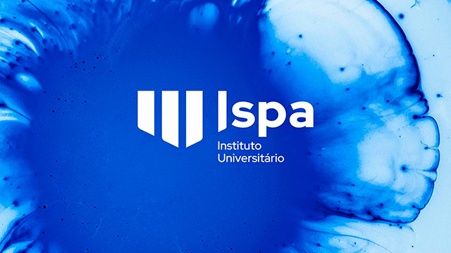
ISPA
Client: Ispa
Discipline: Design
The idea
To celebrate ISPA 60th anniversary, the university institute decided to promote its culture, evolution, cooperation, pioneering spirit, and history in Portugal, with an intervening role in society, in the cultural, social, and scientific fields, through repositioning and rebranding of its the visual identity. The challenge was to create a human, intelligent, intuitive brand and timeless brand. Growing up without losing identity: giving it a new, broader, and more expressive meaning. The brand suffered from 3 stress points which were subject to revision. The name, ISPA, remains but distances itself from the acronym (higher institute of applied psychology) and consolidates itself as a university institute. The symbol that should be a hybrid between the past and the future: keeping Psi, in the memory of its history, but reinterpreting it so that it can have new meanings. And, finally, the visual challenge of change, challenging the old chromatic feel whilst giving the brand a new look.